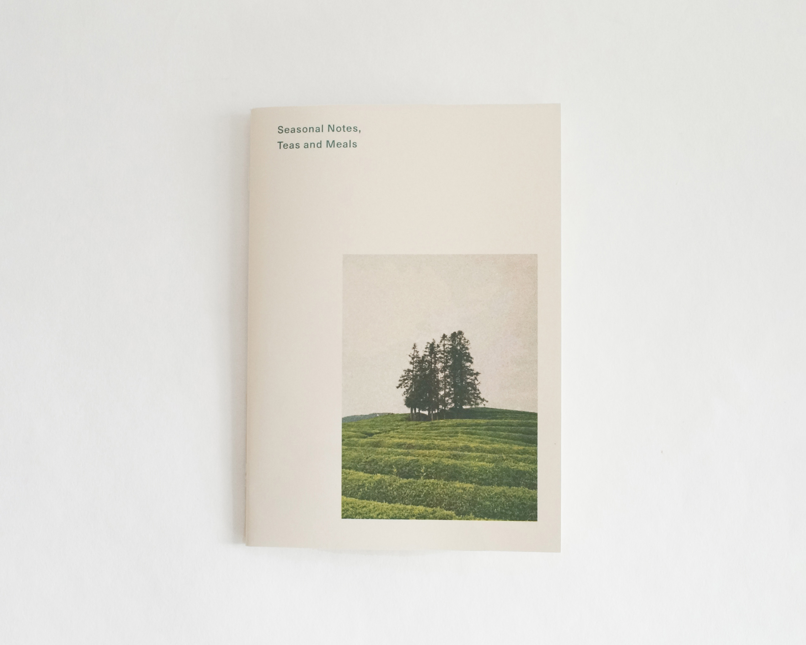
Seasonal Notes: Teas and Meals Zine
A zine celebrating the rhythms of seasons through Japanese home-cooked meals and healing teas.
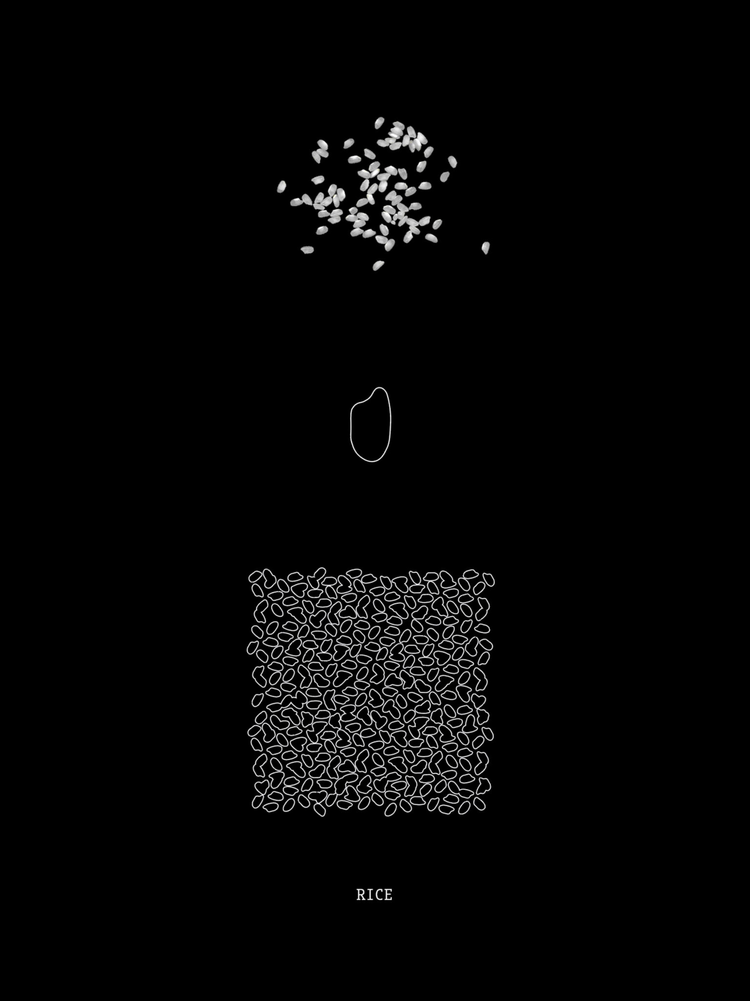
This zine is a collaboration with my family, featuring cherished recipes selected with the seasons and well-being in mind. Rooted in my family’s origins in Japan and shaped by life abroad, the zine weaves together culinary tradition with the quiet beauty of seasonal landscapes across China, Japan, and Canada.
Inspired by the Japanese phrase “Ishoku Dogen”, which originates from traditional Chinese medicine and means “food is medicine,” this project embraces the philosophy that food nourishes both body and spirit. Each recipe is an act of care, attuned to the changing seasons and grounded in a connection to nature and health.
Through comforting meals and healing teas, we hope this zine invites you to slow down, tune into nature, and honor the cycles of life through simple, mindful cooking.
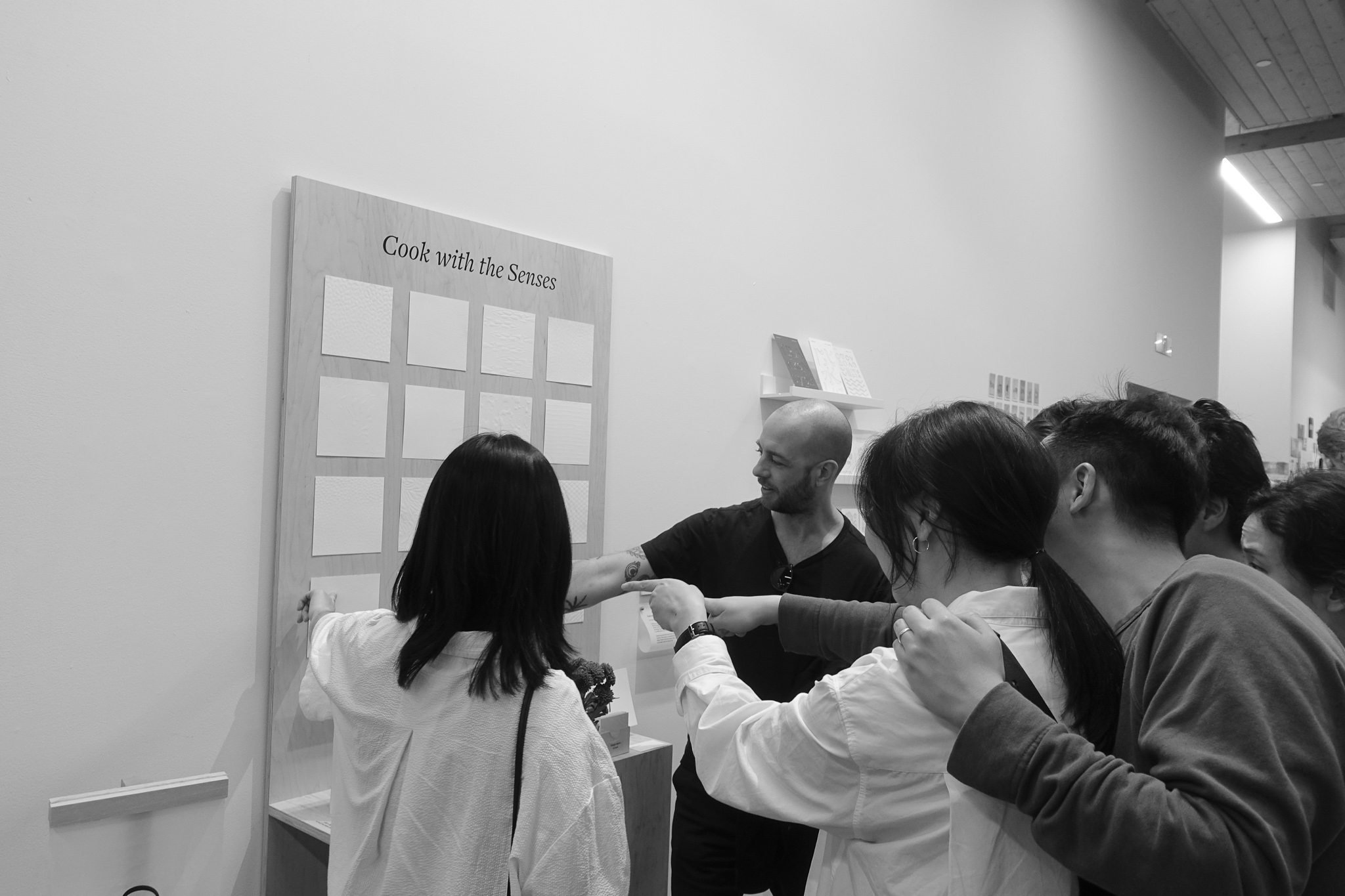
Palate Papers is an experimental exploration of food textures through pattern making and paper embossing.
With a focus on reevaluating food’s creative qualities and our sense of touch, each of the 16 patterns were designed to be experienced by the hand. The embossed patterns are visually subtler, cultivating our acute sensory perceptions to distinguish degrees of flatness, smoothness, and depth in the papers.
DESIGN PROCESS
1 / Pattern Making

2 / Laser Cutting
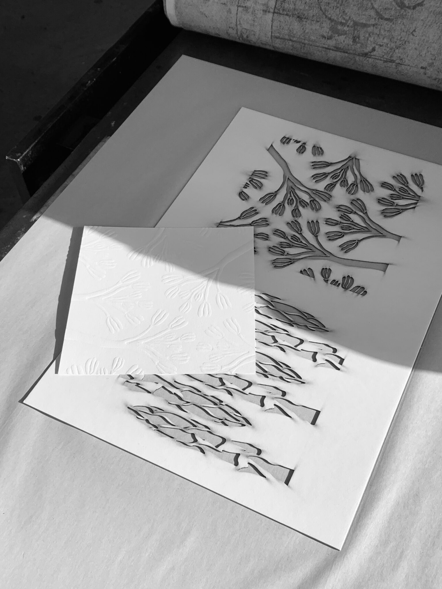
3 / Embossing

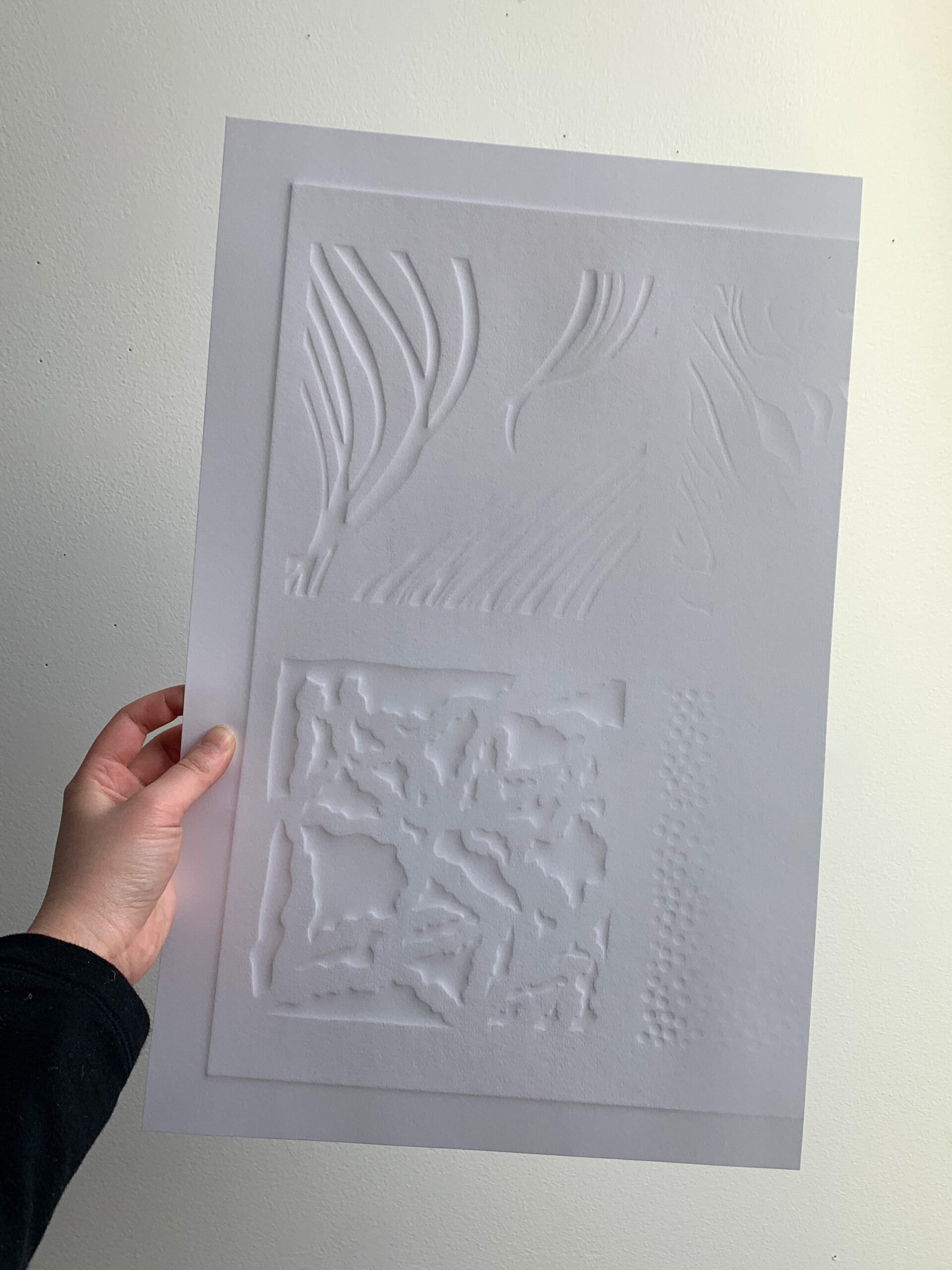

Particular about Paper: White objects, including paper, reflect and scatter all the visible wavelengths of light. Observing how various shades of white paper reflected the emboss and its shadows differently, white and natural white papers were selected to be embossed.
FORM 2 / Cook with the Senses
![]()

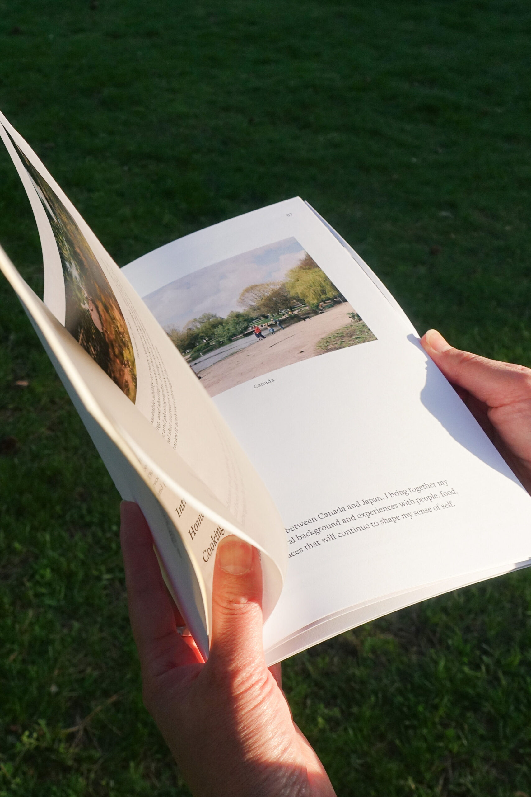
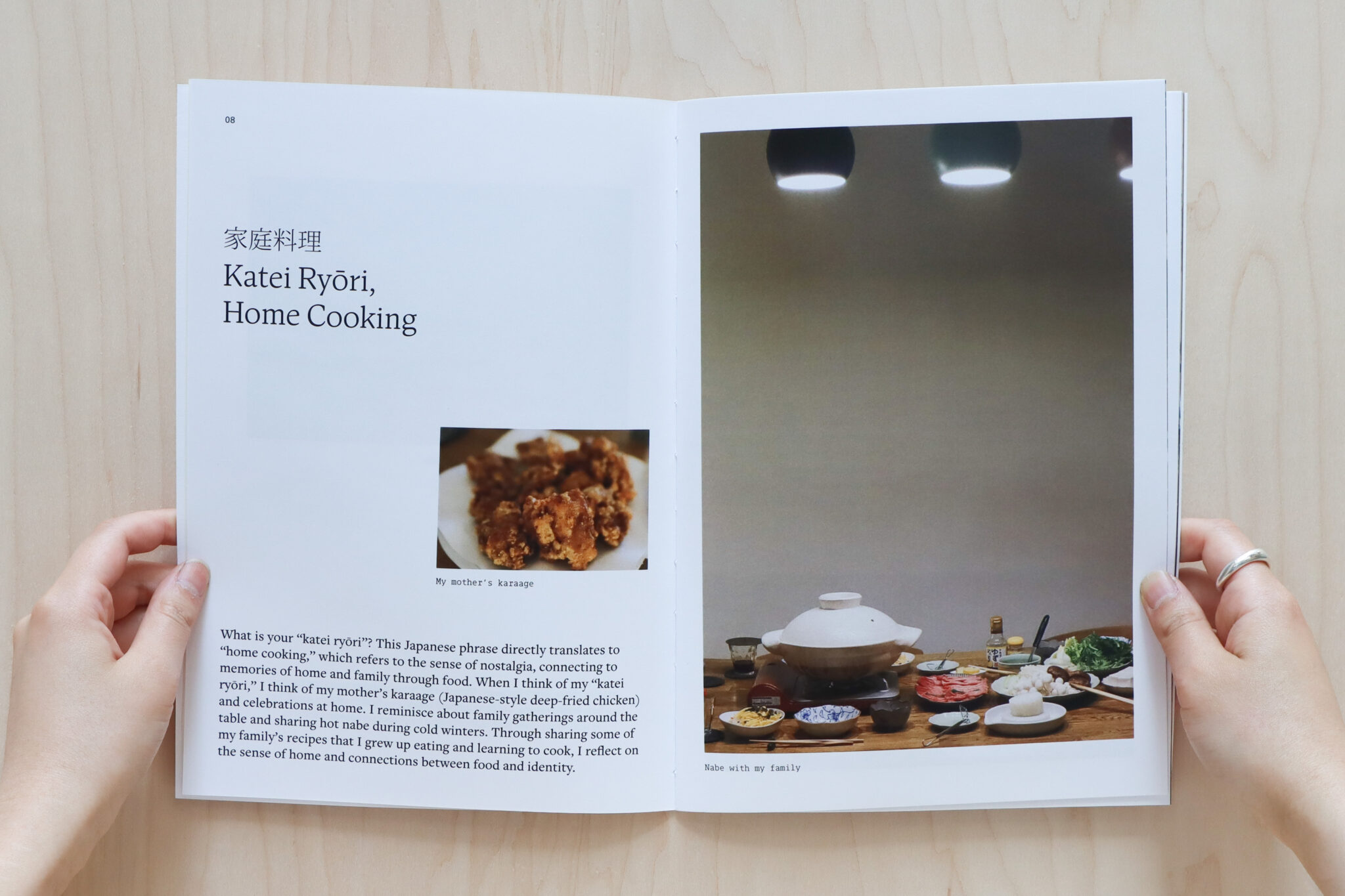
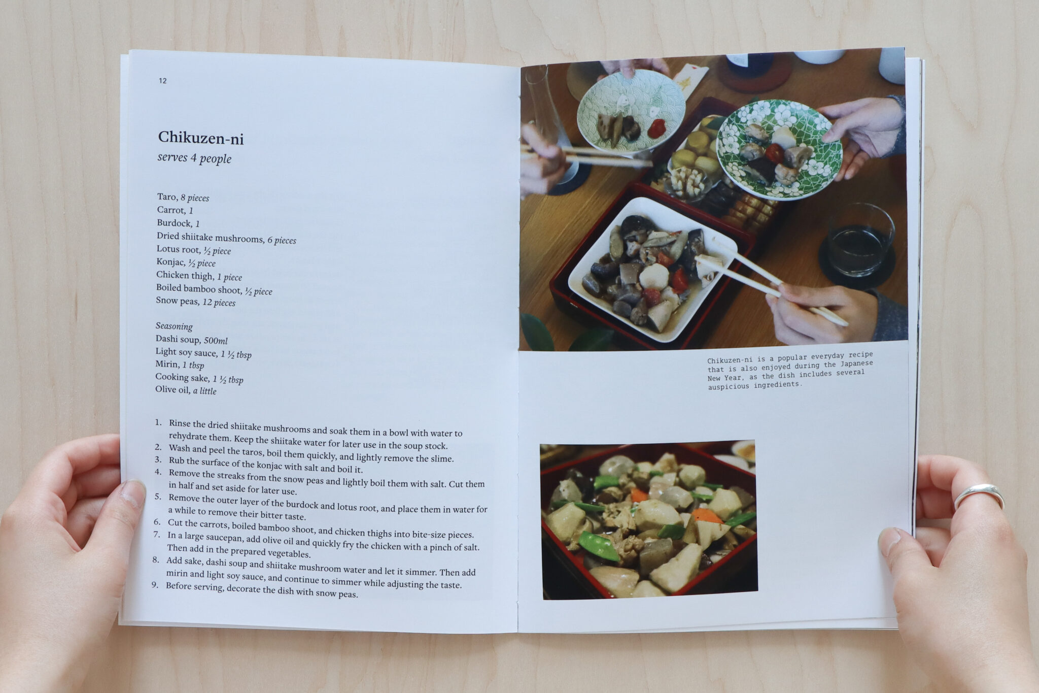
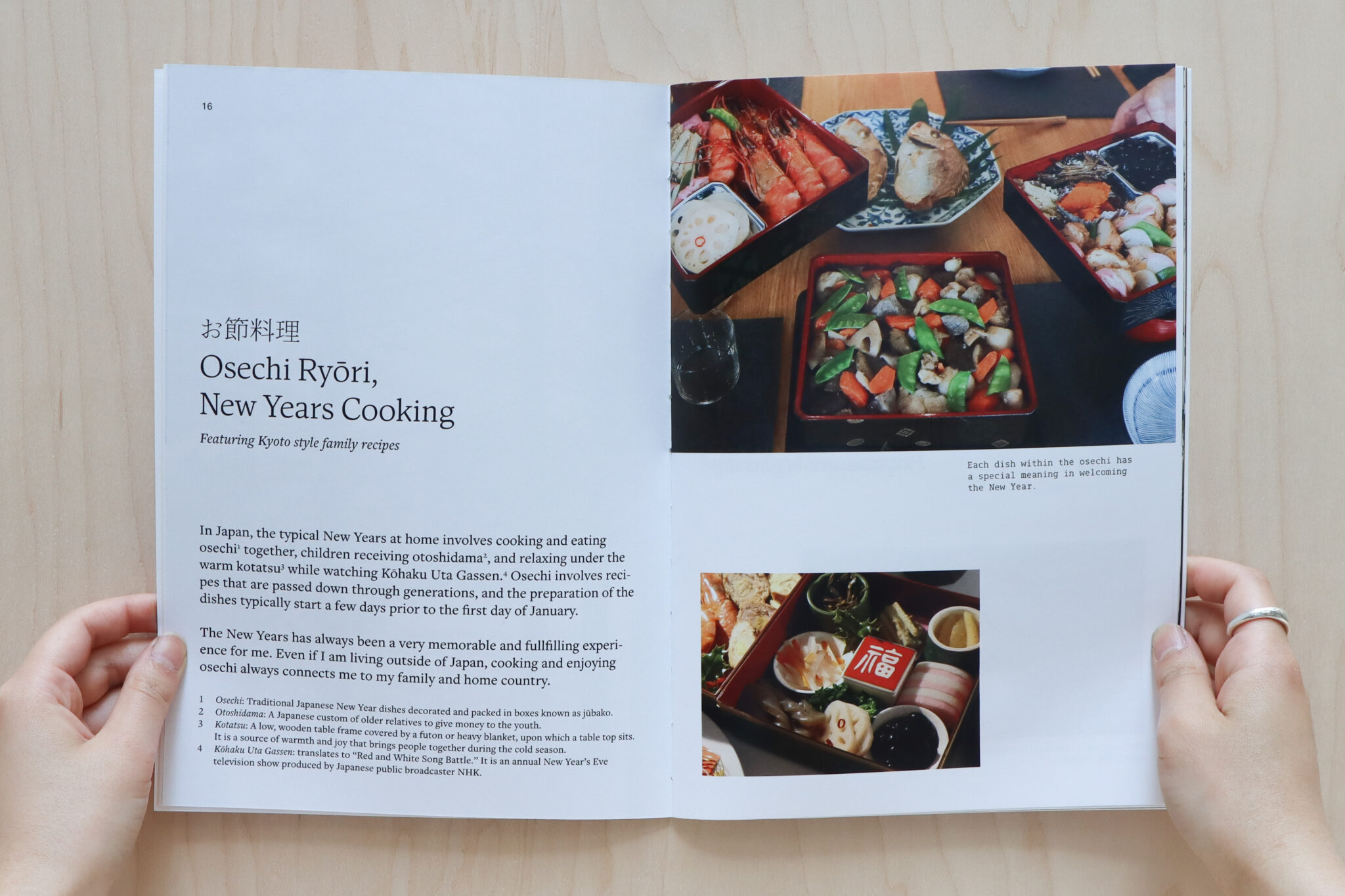
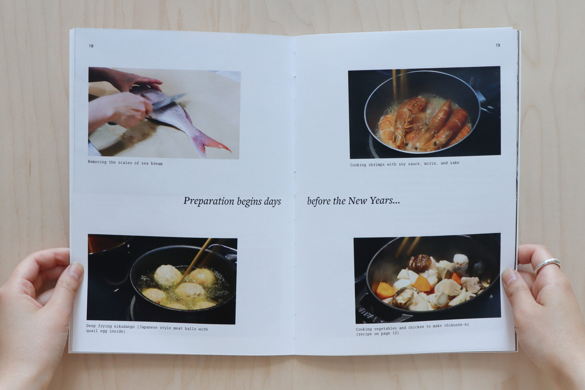
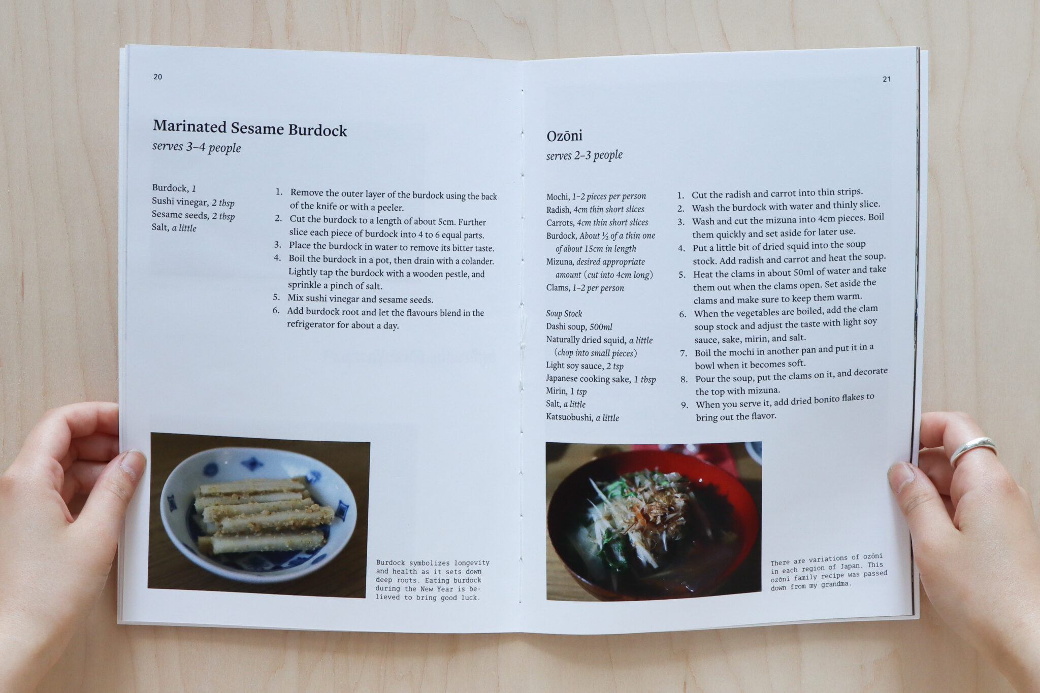
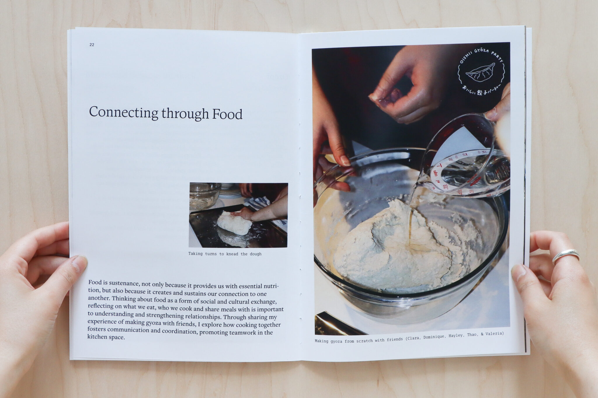
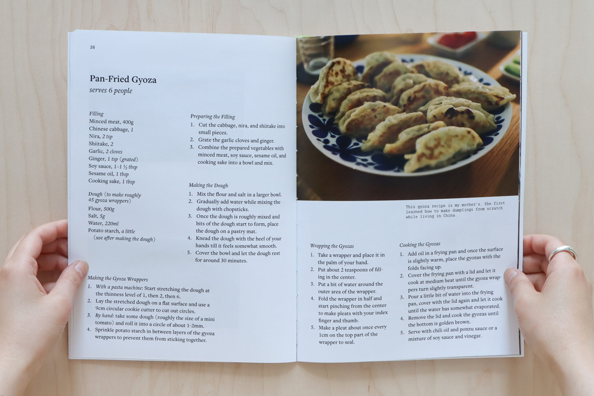
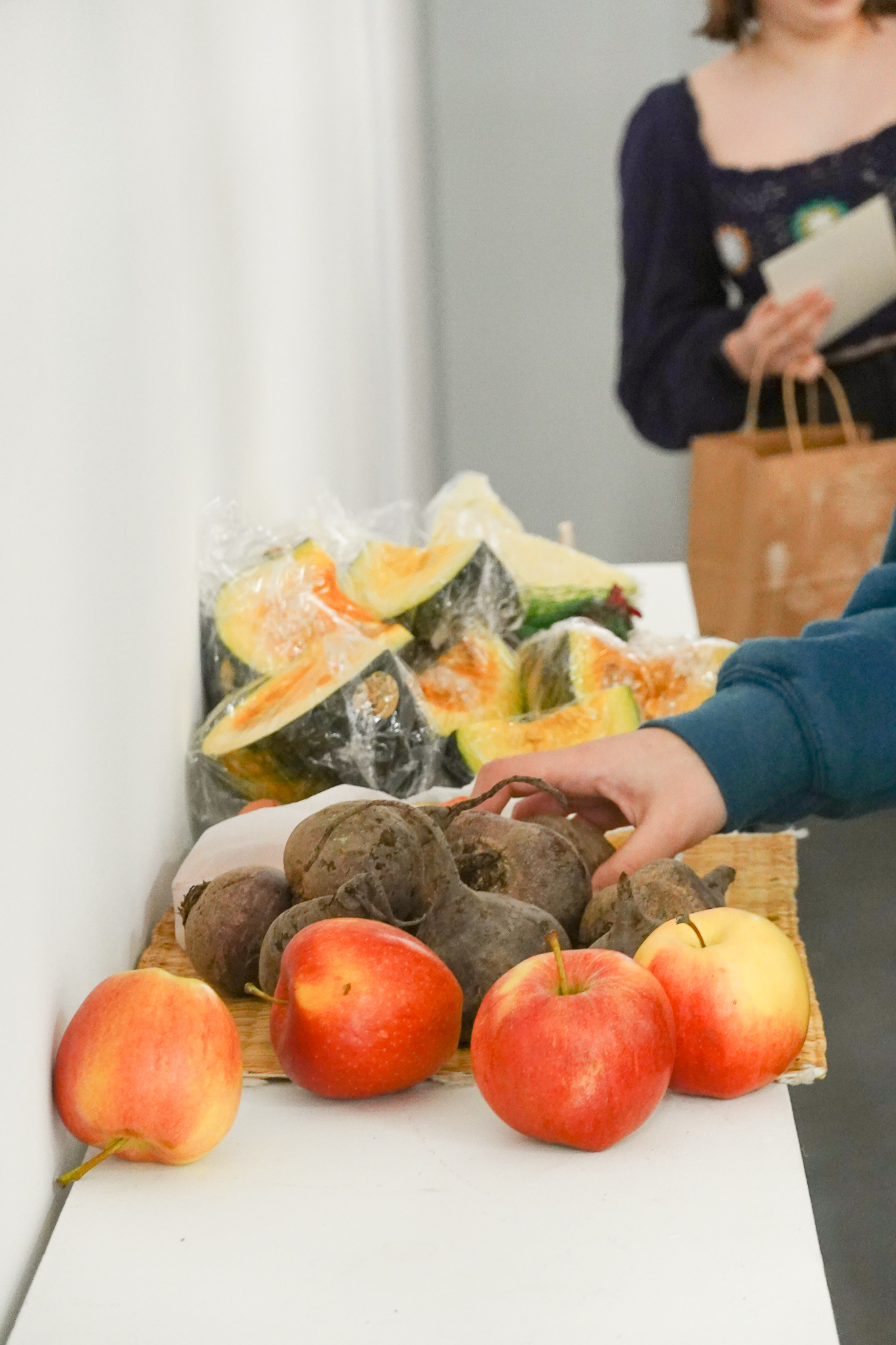
Cook with the Senses is a publication featuring family recipes and storytelling through writing and photography. Through sharing experiences with people, time, and place, the book explores the threads connecting food, culture, and identity.
“Senses” not only refers to the multi-sensory experience of both food and design, but also the feelings and connections we have with and through food. This publication highlights the themes: sense of home, season, connection, and place.

Sense of Home

Sense of Season

Sense of Connection

Sense of Place


FORM 3 / Design with the Senses
![]()

Design with the Senses is a zine that serves as an archive of collaborative food and design workshops completed with students at Emily Carr University. These workshops focused on the relationship between food, design, and community.
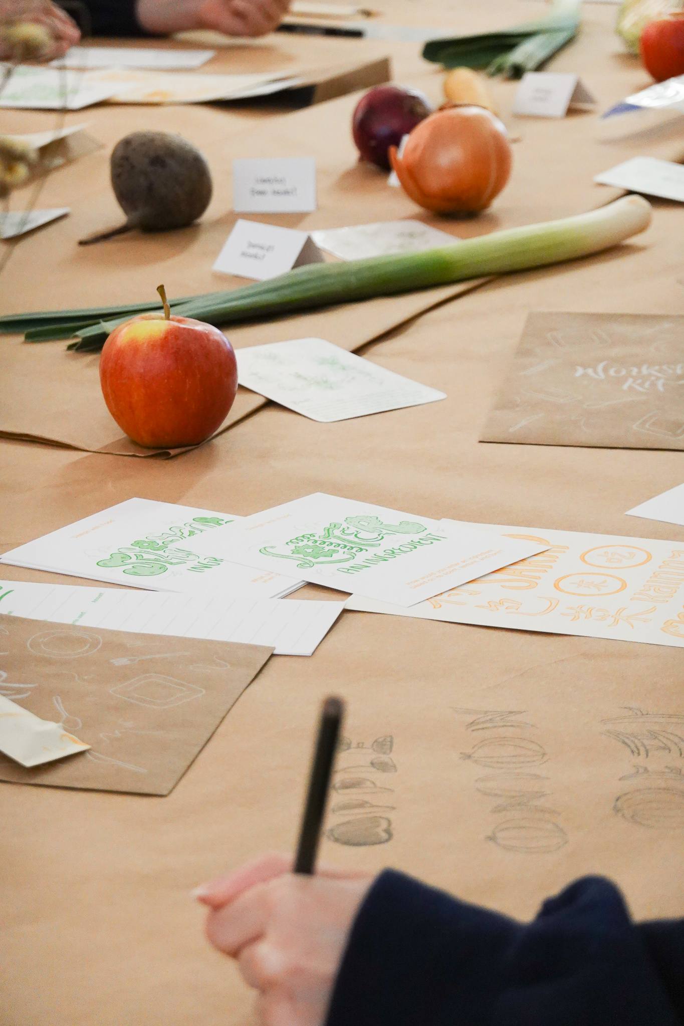
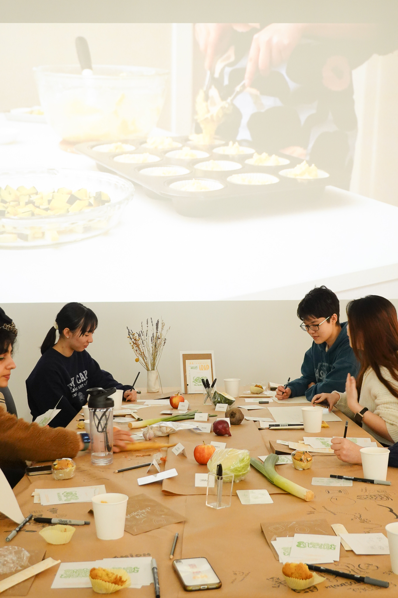
Featuring a collaborative Food & Lettering Workshop organized with Clara NgieThe workshop took place on March 2nd and March 7th of 2023, where seven bilingual ECU students and instructor Reyhan Yazdani participated in generating conversations around food-making, sharing cultural experiences, and languages used in the context of food habits. Combining our multicultural backgrounds and creative skills, we designed workshop kits, conversation prompts, promotional event posters and invitation cards.


Featuring an in-studio Visualize with the Senses Workshop
This workshop was started and completed during one studio class time, where I asked 15 students to visualize their sense of different tastes of sour, sweet, bitter, spicy, salty, and umami. Recognizing a connection between our distinct sense of tastes and visual design’s intuitive and personal aspects, interpretations and expressions with colour, shape, sound, and movement were explored.
EXHIBITION DESIGN & PLANNING
![]()
The Grad Show took place at Emily Carr University throughout May 11—26th of 2023.

The Grad Show took place at Emily Carr University throughout May 11—26th of 2023.
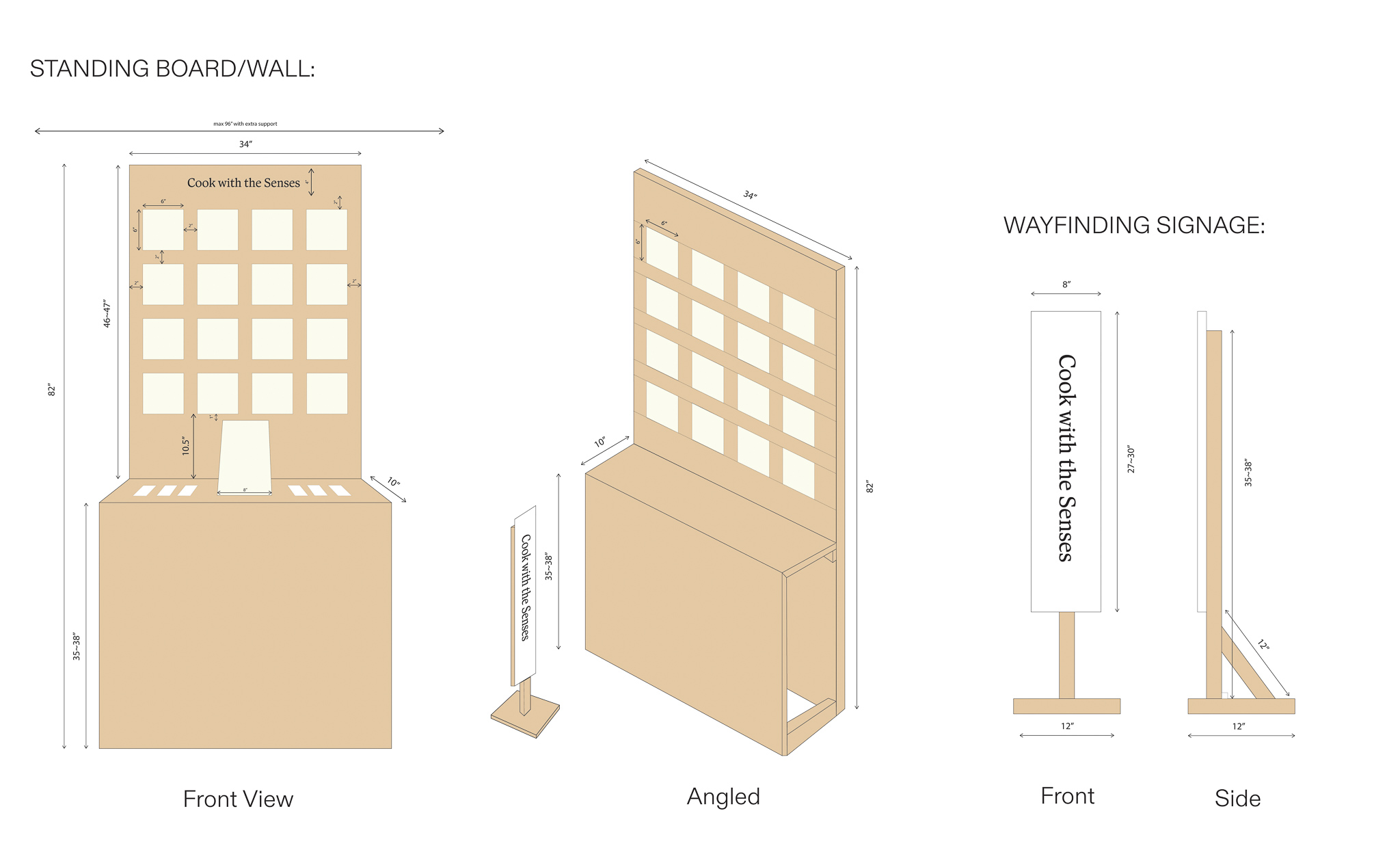
Working with the university’s woodshop technician, Brian Fössl, I designed and built a custom plywood standing wall + table for my exhibit. One of the main reasons why I worked with plywood was to create contrast with my white and cream Palate Paper tiles. As well, plywood was very accessible at my university, and I designed it so it can be taken apart and be reused for future exhibitions.
I also designed a wayfinding signage to stretch and hang a silkscreen printed fabric showcasing my title. The locaiton of my installation was right around the corner of a shared wall space, so I took this opportunity to create a standing signage that can be seen as people walk towards the area.
I also designed a wayfinding signage to stretch and hang a silkscreen printed fabric showcasing my title. The locaiton of my installation was right around the corner of a shared wall space, so I took this opportunity to create a standing signage that can be seen as people walk towards the area.